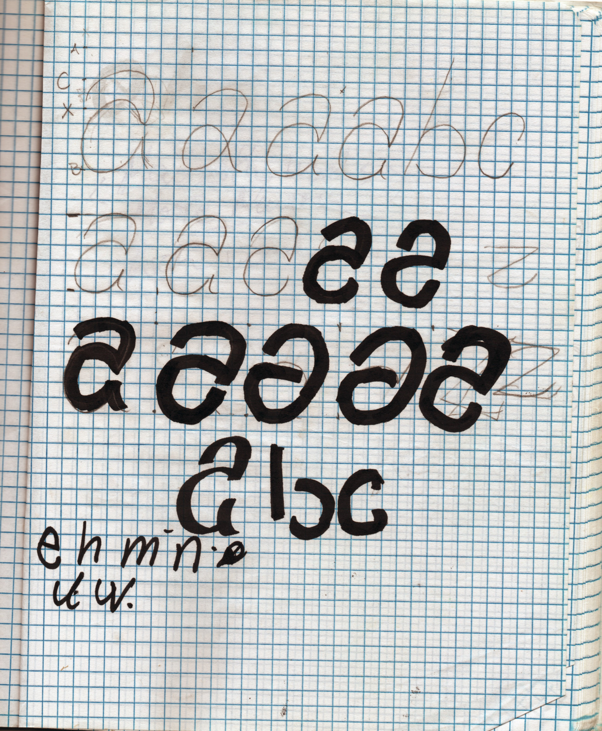
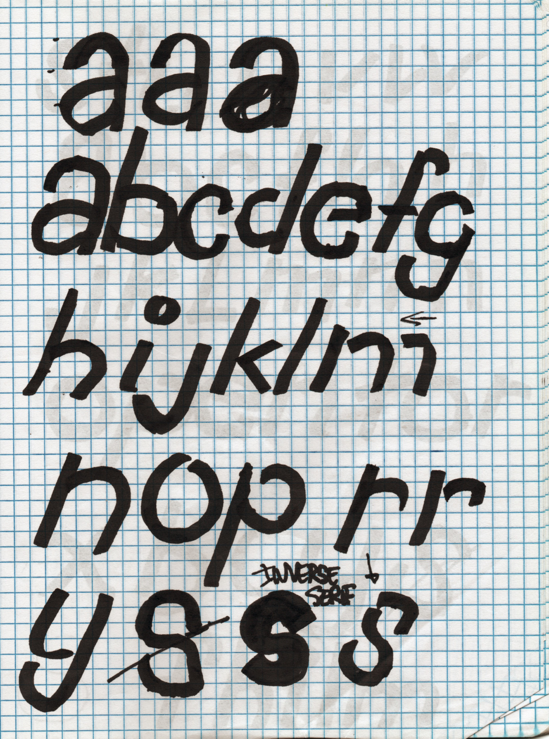
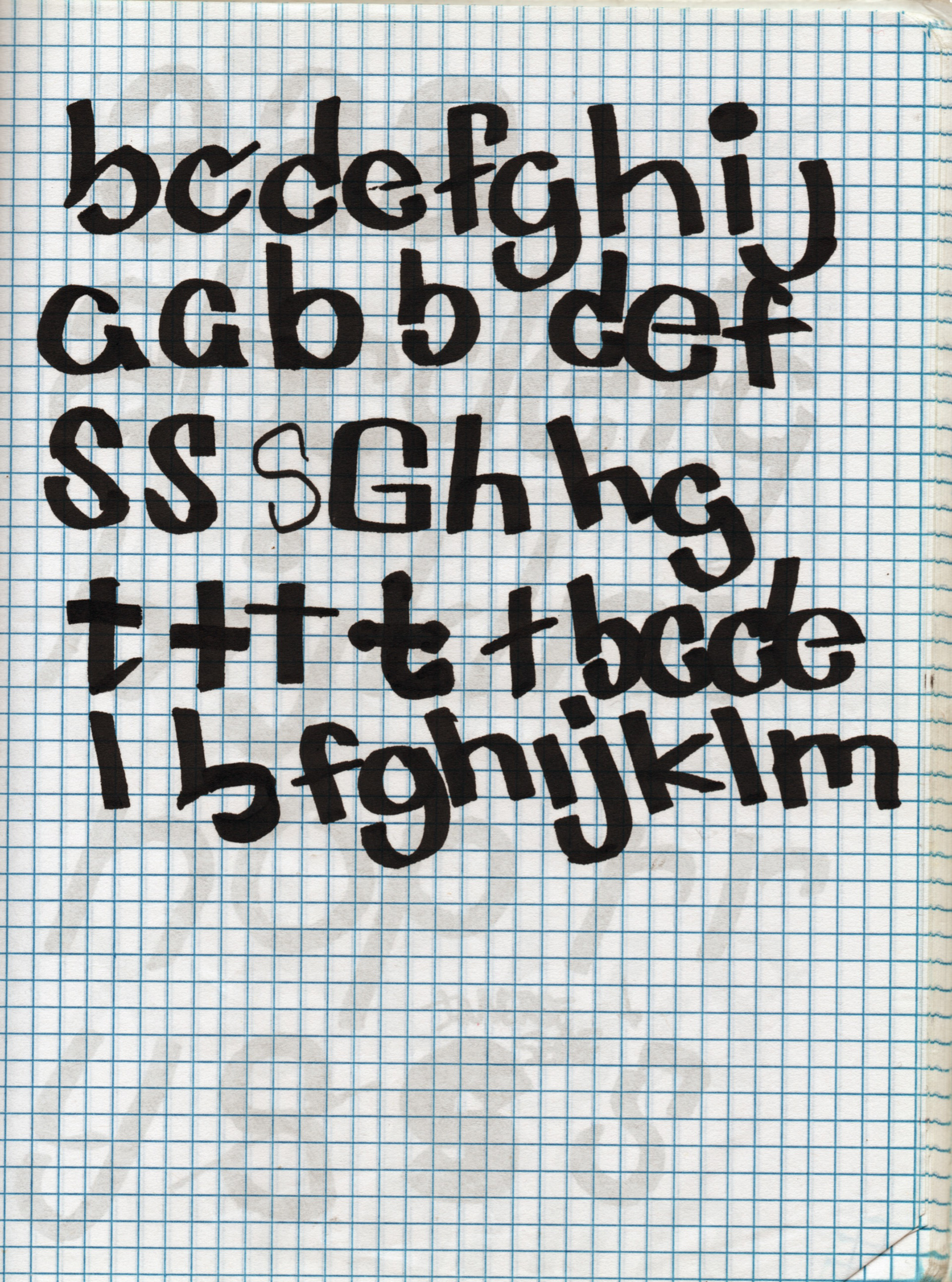
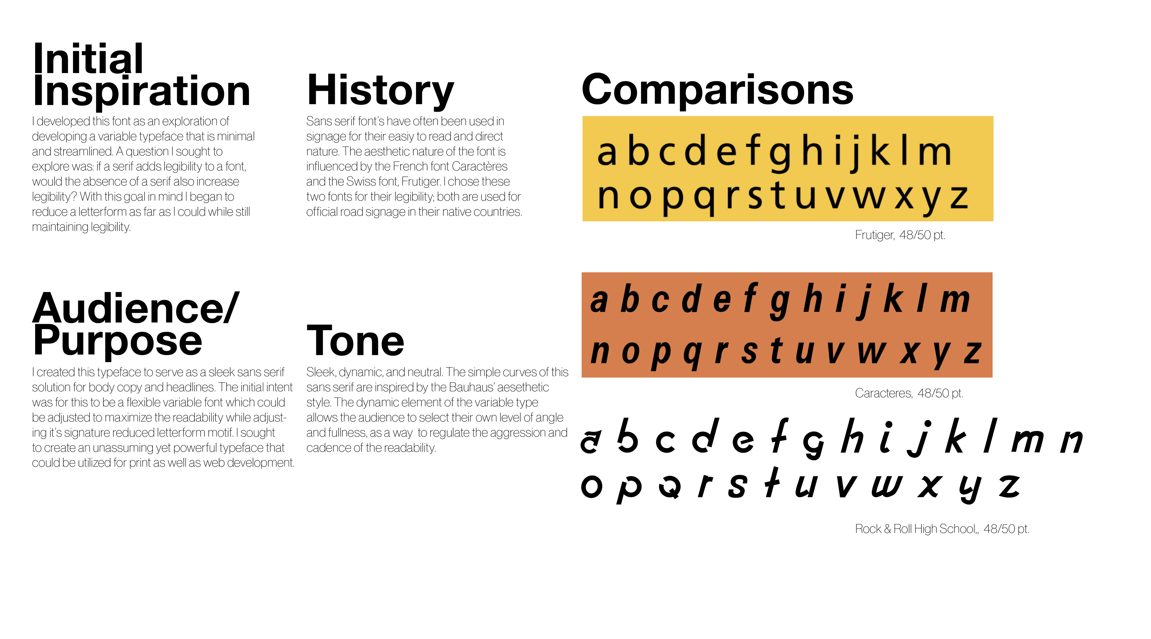
I created this typeface as a personal project in October of 2019. It is an all lowercase sans serif for general body copy text. The concept I explored was to reduce a letterform beyond its most basic elements as a way of improving legibility. I was curious what the results would be there was an inversion of the serif, creating a negative space within the letterform. The aesthetic nature of the font is influenced by the French font Caractères and the Swiss font, Frutiger. I chose these two fonts to work between for their extreme legibility; both are used for official road signage in their native countries. The final goal was to have this realized as an adjustable variable web typeface. The designer would be able to alter the angle of the italics and gap in the letterform to suit their needs.